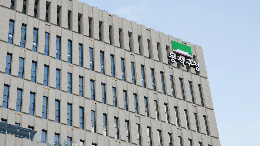
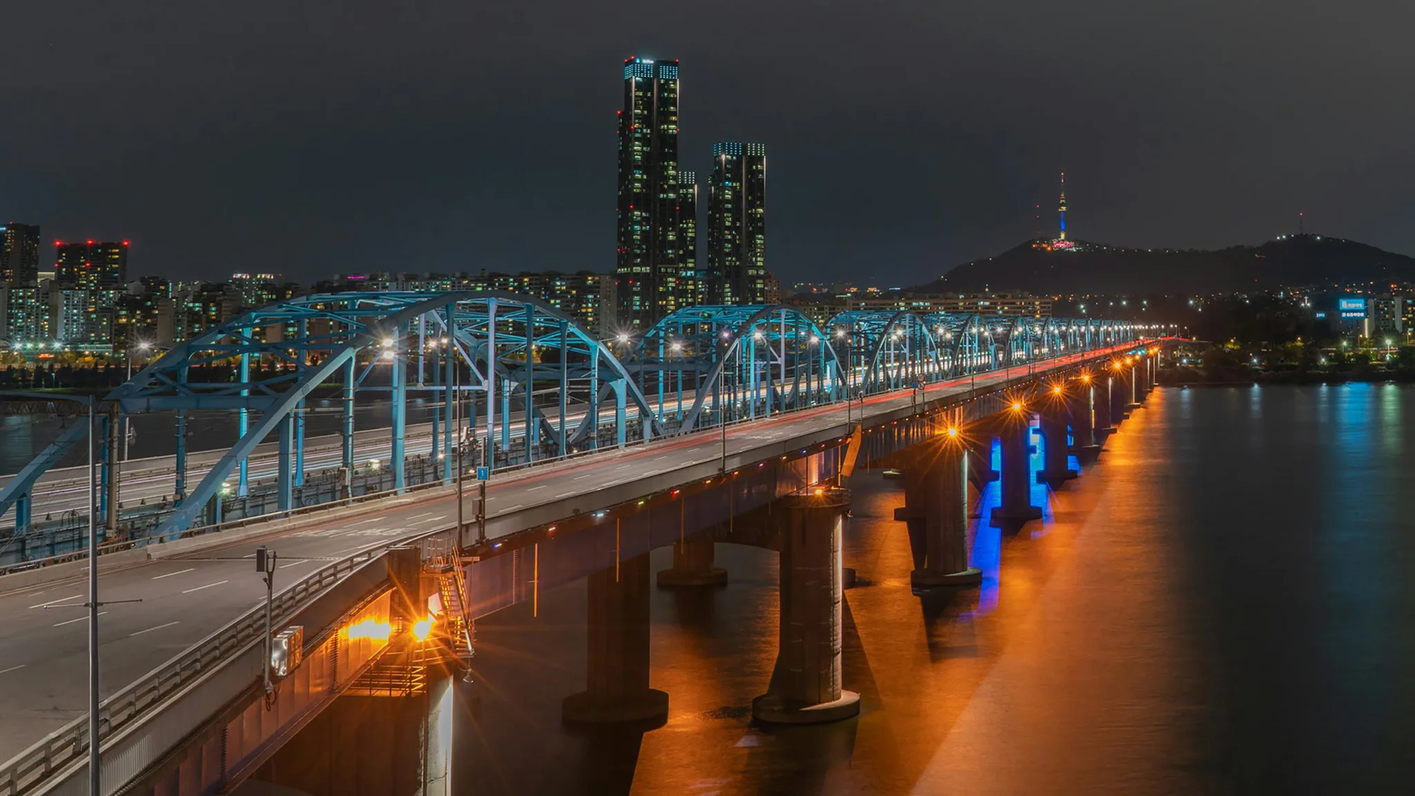
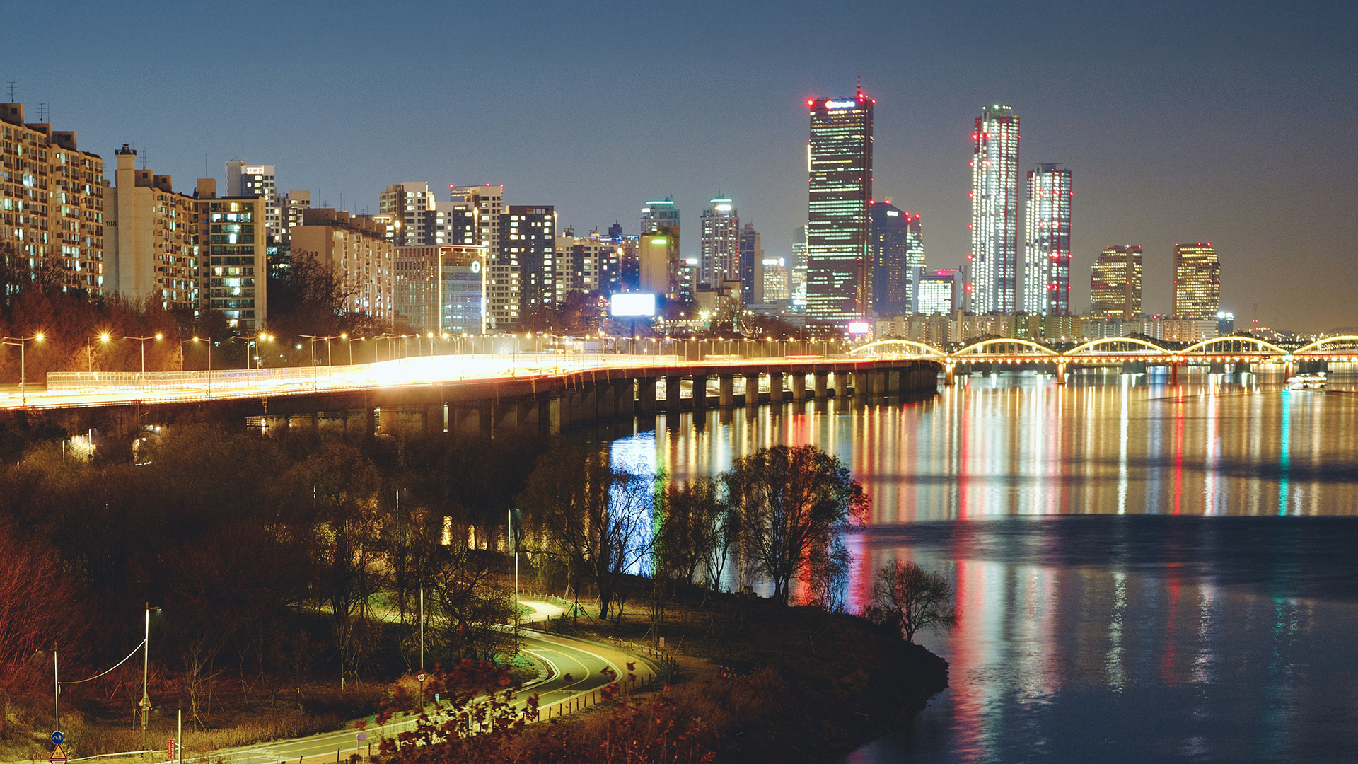
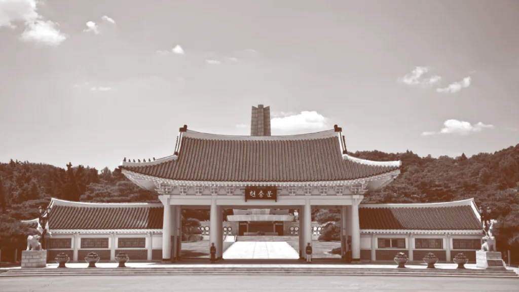
동작구는 ‘노들나루’를 중심으로 서울의 남과 북을 잇는 교통과 상업의 중심지와 서울현충원, 충신의 상징 사육신묘 등의 문화유산은 동작구의 철학과 문화적 기반을 이루고 있습니다. 또한 동작구는 대한민국 성장과 발전의 역사적 상징들을 품고 있어, 불굴의 도전 정신, 멈추지 않는 열정적인 에너지, 무한한 성장 잠재력을 정체성으로 삼고 있는 도시입니다.
Dongjak-gu serves as a hub for both transportation and commerce, connecting the north and south of Seoul, centered around ‘Nodeulnaru’ (Nodeul Ferry). Furthermore, cultural heritage sites such as the Seoul National Cemetery and the Saryuksin (Six Loyal Subjects) Shrine, a symbol of loyalty, form the philosophical and cultural foundation of Dongjak-gu.
Sector
Public Administration
Expertise
Brand Revitalization
City Identity
Visual Identity
DONG JAK in Motion
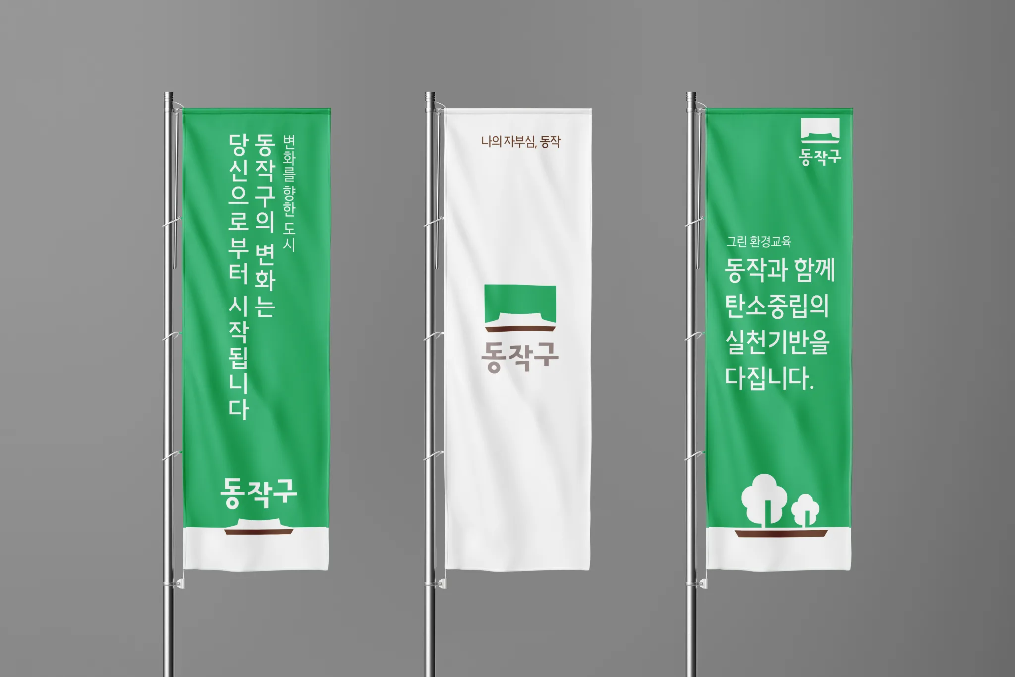
누구보다 앞서는 동작,
가치를 이어가는 동작,
미래로 나아가는 동작
Dongjak Gu Brand Design Renewal project
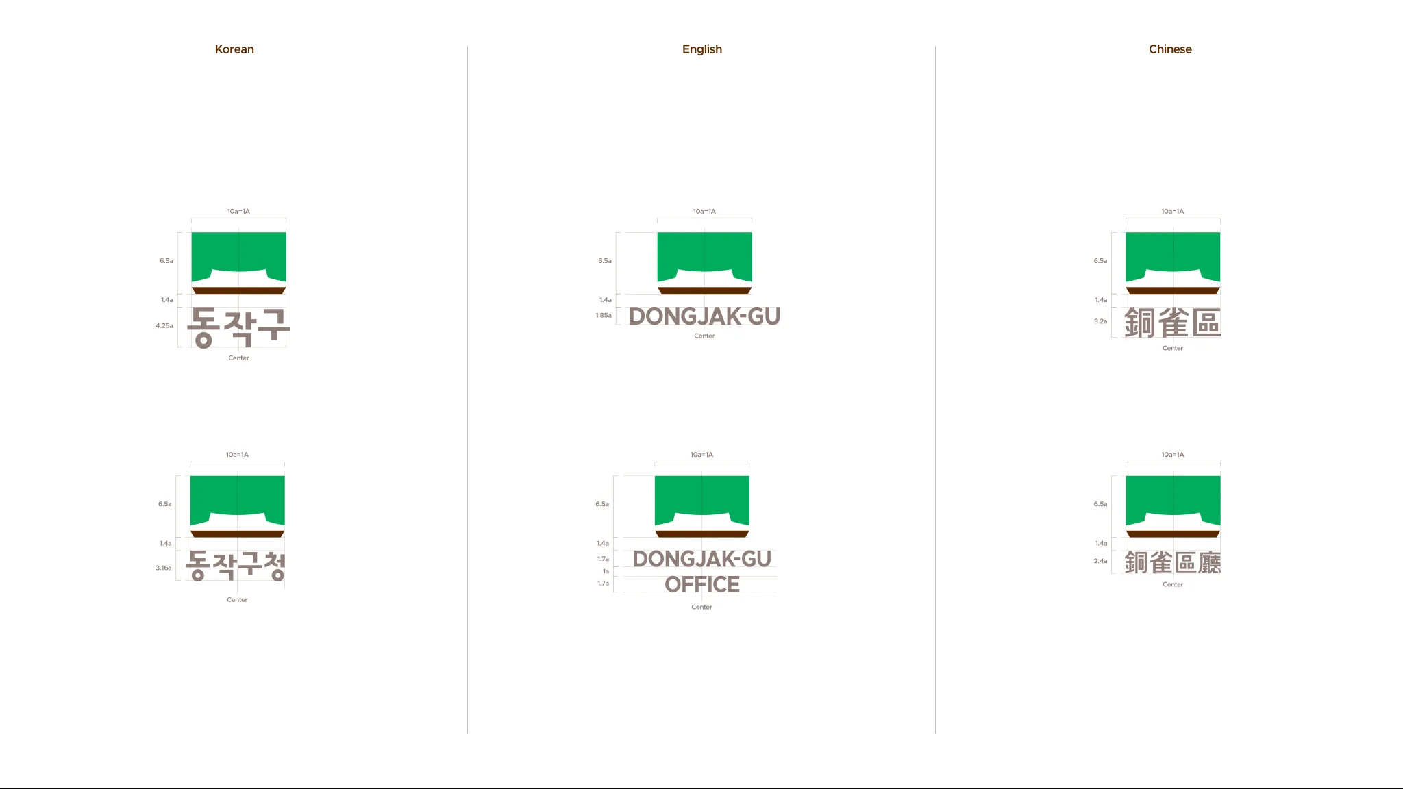
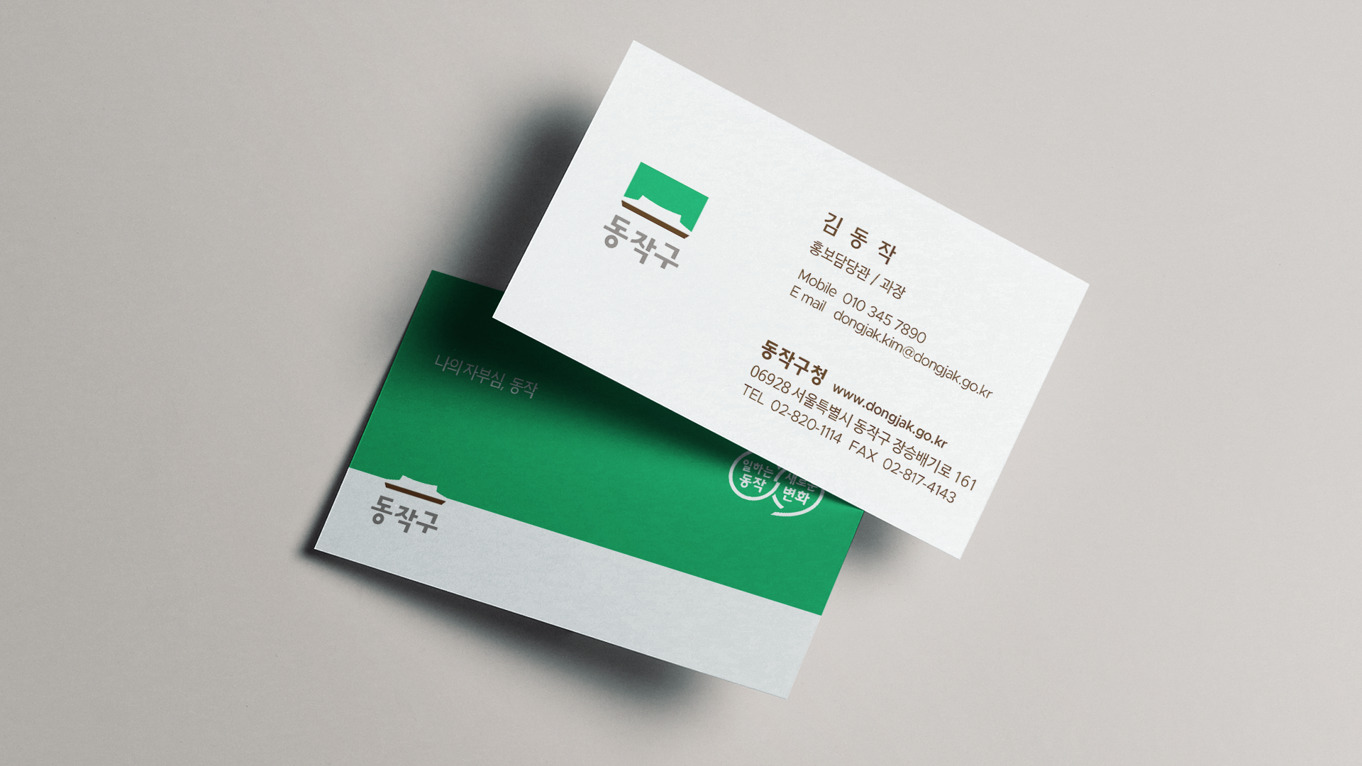
스튜디오라자는 동작구청과 협업하여 동작구의 브랜드 아이덴티티를 새롭게 구축했습니다. 호국정신의 역사적 배경을 바탕으로, 무한한 성장을 향해 도전하고 변화하는 동작구의 모습을 담고자 대표 이미지를 중심으로 다양한 환경에 유연하게 적용할 수 있는 디자인 시스템을 구축해, 안정감 속에서도 도전과 열정이 공존하는 구의 정체성을 표현했습니다.
Studio lajah collaborated with the Dongjak District Office to redefine the brand identity of Dongjak-gu. Rooted in the historical spirit of national defense, the new identity embodies a district that continually challenges itself and evolves toward boundless growth. Built around a core visual motif, the flexible design system expresses a sense of stability and passionate drive across diverse applications.
TYPE A
TYPE B
TYPE C
Flexible
Color
& Icon
System
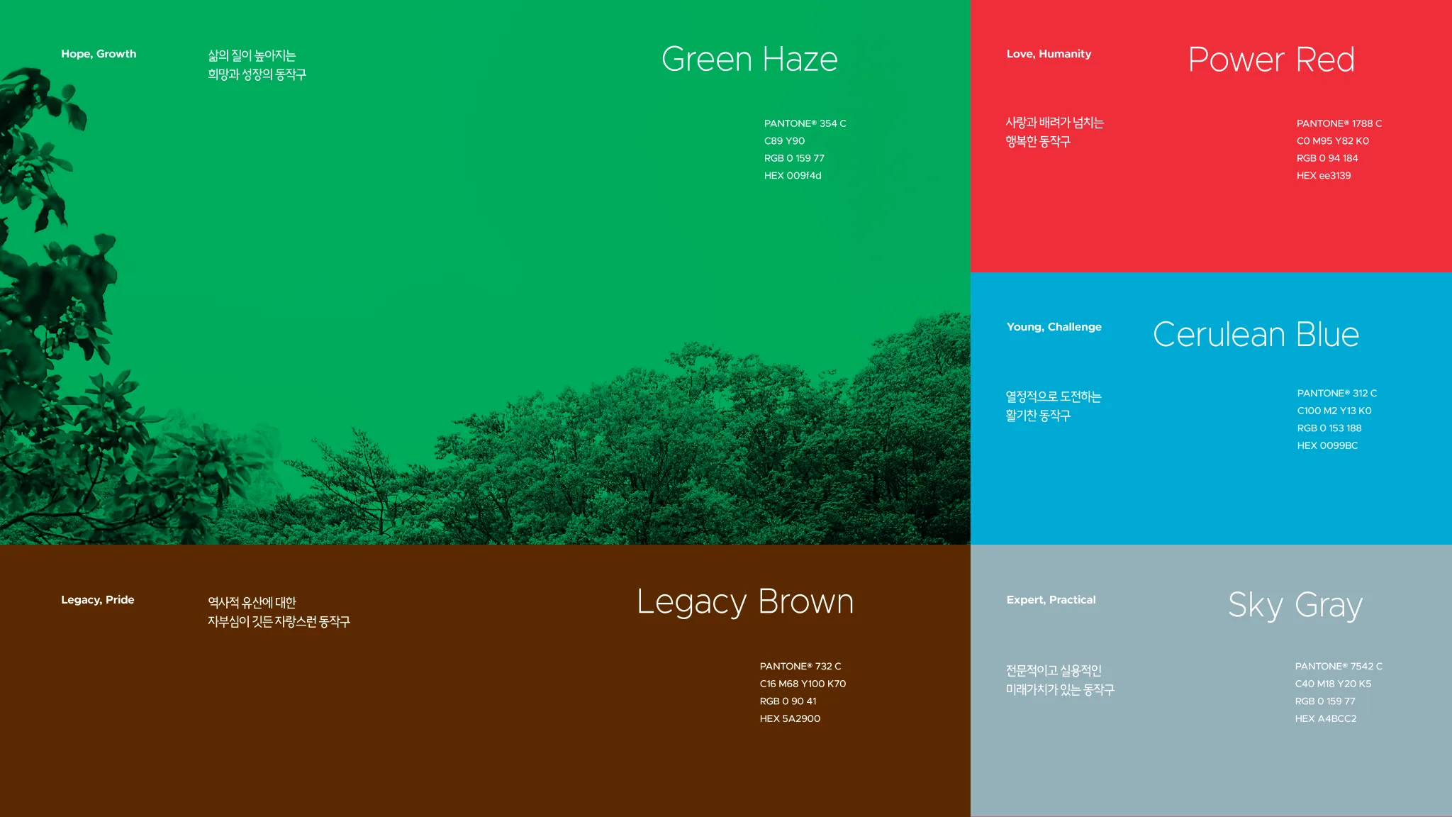
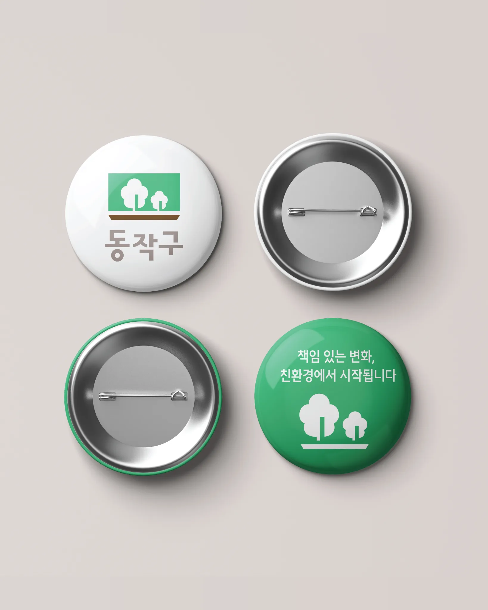
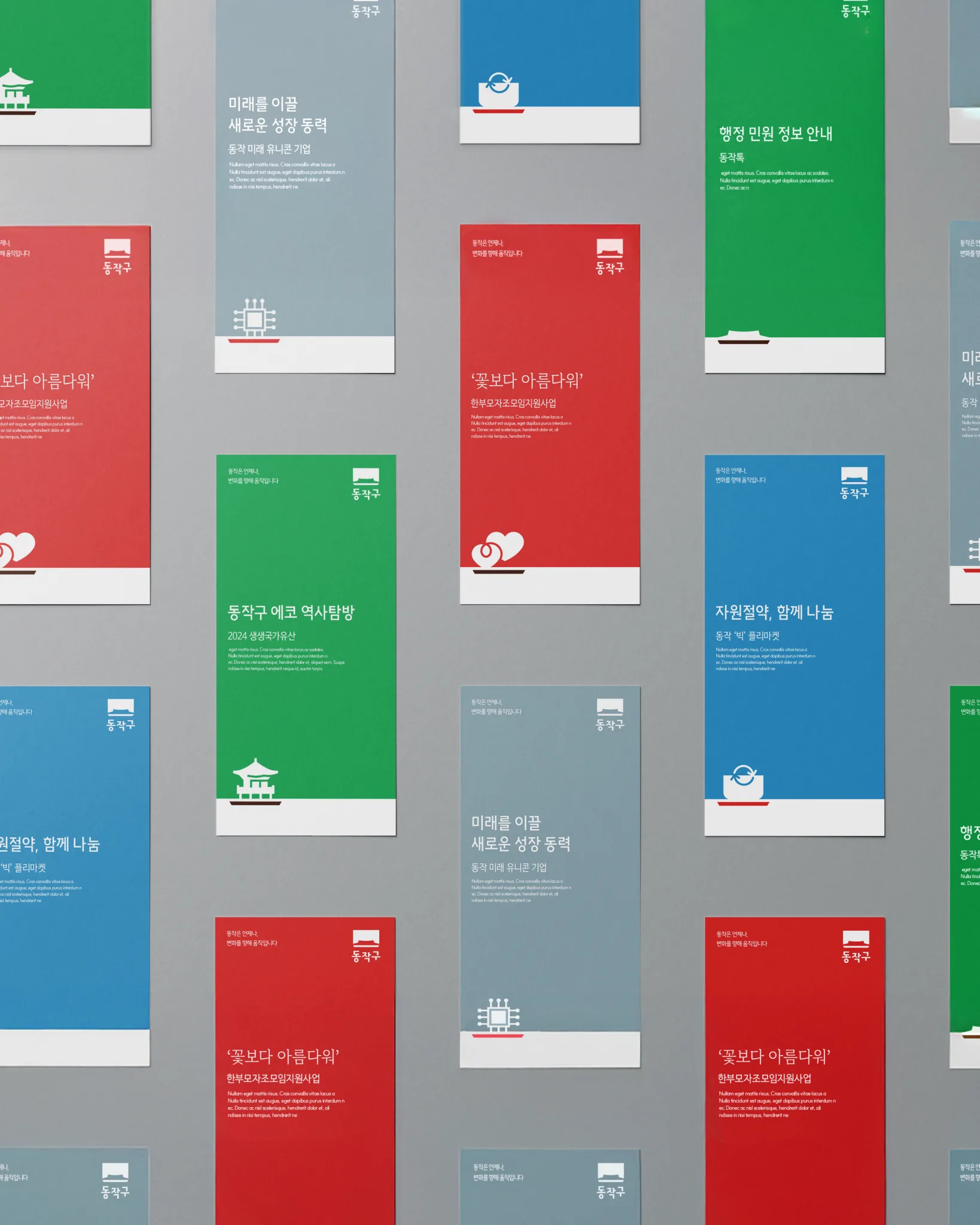
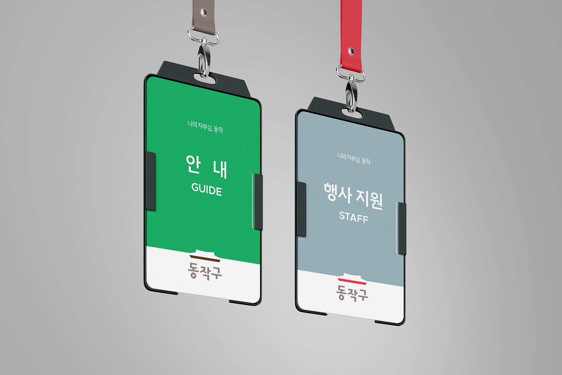
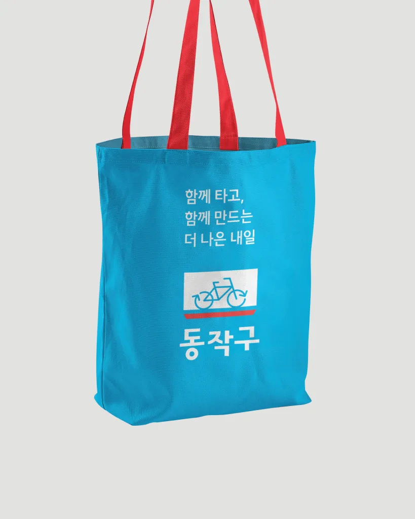
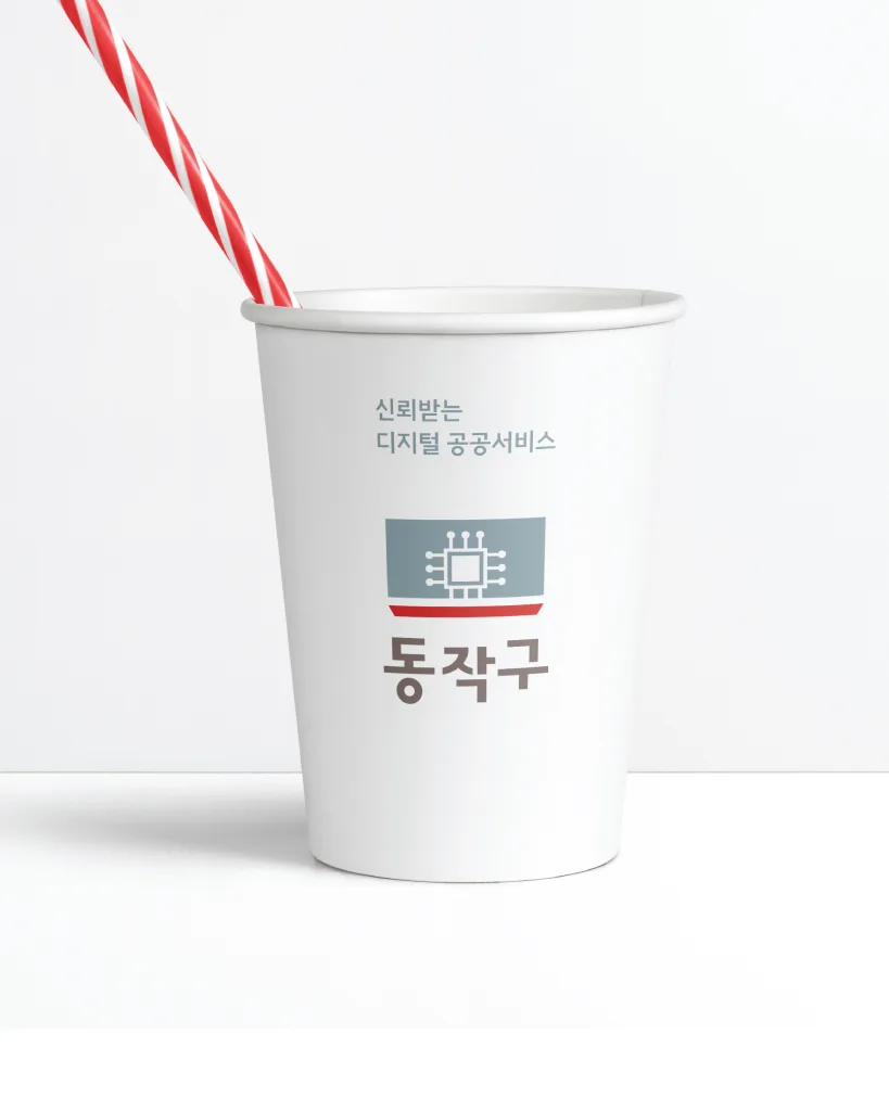
동작구의 창의성과 도전정신은 구정 활동의 다양한 성격을 반영한 색상과 아이콘 활용에 나타납니다. 메인 로고와 색상뿐 아니라, 여러 구정 활동과 구민들의 일상 속에서도 이러한 역동성과 에너지를 느낄 수 있도록 컬러 시스템을 구성했습니다.
The creativity and spirit of challenge that define Dongjak-gu are expressed through the use of colors and icons that reflect the diverse nature of the district’s public initiatives. Beyond the main logo and color palette, the color system was designed to convey this sense of dynamism and energy across various municipal activities and in the everyday lives of its residents.
2F, 52, Bangbae-ro 11-gil, Seocho-gu, Seoul, Republic of Korea
우 06687 서울특별시 서초구 방배로11길 52, 로열하우스 2층
Dongjak-gu
In brief
동작구는 '노들나루'를 중심으로 서울의 남과 북을 잇는
교통과 상업의 중심지와, 오랜 역사를 자랑하는 3개의 사립 대학과 함께 100여 개의 학원가가 밀집해 있는 교육의 요람 역할을 수행하고 있습니다.
국가와 민족을 위해 산화한 호국영령을 모신 서울현충원, 충신의 상징 사육신묘, 애국정신이 머무는 국사봉 등의 문화유산은 동작구의 철학과 문화적 기반을 이루고 있습니다.
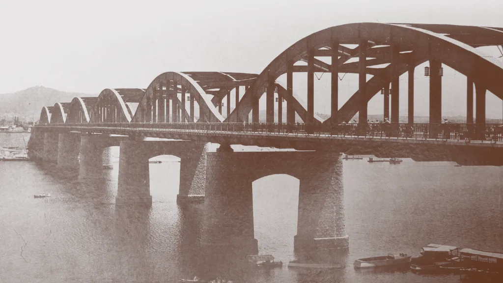
또한 동작구는 우리나라 최초의 철도역인 노량진역을 비롯하여 대한민국 성장과 발전의 역사적 상징들을 품고 있어,
더 나은 변화를 위한 불굴의 도전 정신, 멈추지 않는 열정적인 에너지, 무한한 성장 잠재력을 정체성으로 삼고 있는 도시입니다.
Dongjak-gu serves as a central hub for transportation and commerce, connecting the north and south of Seoul, centered around 'Nodeulnaru'. It is also a cradle of education, home to three private universities with long histories, along with a concentration of over 100 *hagwons* (private academies). Cultural heritage sites such as the Seoul National Cemetery, which enshrines the patriots who sacrificed their lives for the nation and people, the monument to loyal subjects, Sayeongsinmyo (Tomb of the Six Martyred Ministers), and Guksabong Peak, a symbol of patriotic spirit, form the philosophical and cultural foundation of Dongjak-gu. Furthermore, Dongjak-gu embodies historical symbols of the Republic of Korea's growth and development, including Noryangjin Station, the nation's first railway station. Thus, the city's identity is defined by an indomitable spirit of challenge for better change, unstoppable passionate energy, and infinite growth potential.
City Identity
동작의 과거에는
새로운 시대를 향한 대한민국의 염원이 모여 철도시대를 열었고, 무한한 가능성에 대한 서울시민의 희망이 한강 이남의 발전을 이끌었습니다.
동작의 현재는
‘올바른 가치’를 품은 선조들의 정신을 기반으로 전통을 재해석하고, ‘내일의 목표’를 향한 청년들의 열정이 모여 행복한 도시로 성장하고 있습니다.
동작은 앞으로도,
더 나은 내일을 위해 멈추지 않고, 계속해서 변화를 향해 움직이겠습니다.
In the past, Dongjak-gu was a place where:
The aspirations of the Republic of Korea for a new era gathered, ushering in the age of railroads, and the hopes of Seoul citizens for infinite possibilities drove the development of the area south of the Han River.
In the present, Dongjak-gu is:
Growing into a happy city by reinterpreting tradition based on the spirit of ancestors who embraced 'righteous values', and by bringing together the passion of young people striving towards 'tomorrow's goals'.
Moving forward, Dongjak-gu will:
Continue to move towards change without stopping, for a better tomorrow.