LiSTA SERIES

Uniquely Typical, Strategically Smart

overview

리스타는 자동차 오일 전문 온라인 유통사 피카몰이 개발한 국산 엔진오일 브랜드입니다. 리스타가 지닌 성능 가치와 시장 내 포지셔닝을 분명하게 드러내기 위해, 브랜드 정체성을 재정립하고 라인업 전반의 디자인 체계를 구축하는 프로젝트를 스튜디오 라자와 함께 3년여에 걸쳐 진행했습니다.

엔진오일 카테고리는 이미 포화 상태에 가까운 경쟁 구도를 형성하고 있으며, 소비자는 디자인 요소뿐 아니라 제품 퍼포먼스, 신뢰성, 구매 경험 전반을 종합적으로 평가해 브랜드를 선택합니다. 이러한 환경에서 리스타는 다층적 선택 요인 속에서도 일관된 메시지를 전달할 수 있는 명확한 브랜드 포지셔닝을 확립하고, 접점 전반에서 차별화된 경험을 제공할 견고한 시각적 아이덴티티 시스템을 구축하는 것이었습니다.

Listar is a Korean engine oil brand developed by Pikamall, an online distributor specializing in automotive lubricants. To clearly express the brand’s performance values and market positioning, we collaborated with Studio Lajah over three years to redefine Listar’s brand identity and establish a cohesive design system across its full product lineup.

In a highly saturated engine oil market where consumers evaluate not only visual design but also product performance, reliability, and overall purchasing experience, Listar aimed to secure a clear and consistent brand position. The project focused on building a robust visual identity capable of delivering a differentiated and coherent experience across all customer touchpoints.

전문성과 보편성 : 다음 단계로의 고민

Professionalism and Universality : A Reflection Toward the Next Stage

회원 8만 4천 명 규모의 네이버 카페 ‘엔불진’은 10여 년간 조형래 대표와 김보훈 박사가 운영해 온 엔진오일 관련 커뮤니티로, 사용자들의 실제 경험과 전문 분석이 활발히 공유되는 공간입니다. 피카몰은 커뮤니티의 신뢰와 데이터를 기반으로, 전문성과 진정성을 갖춘 리스타 브랜드 문화를 구축하고 있습니다.  

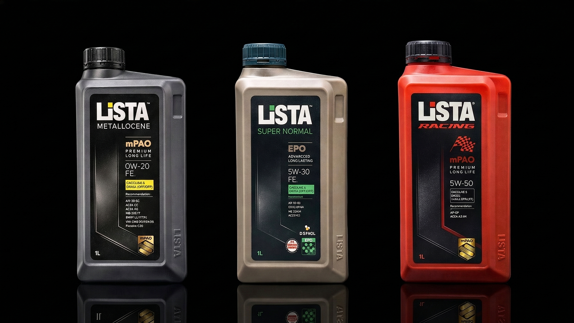
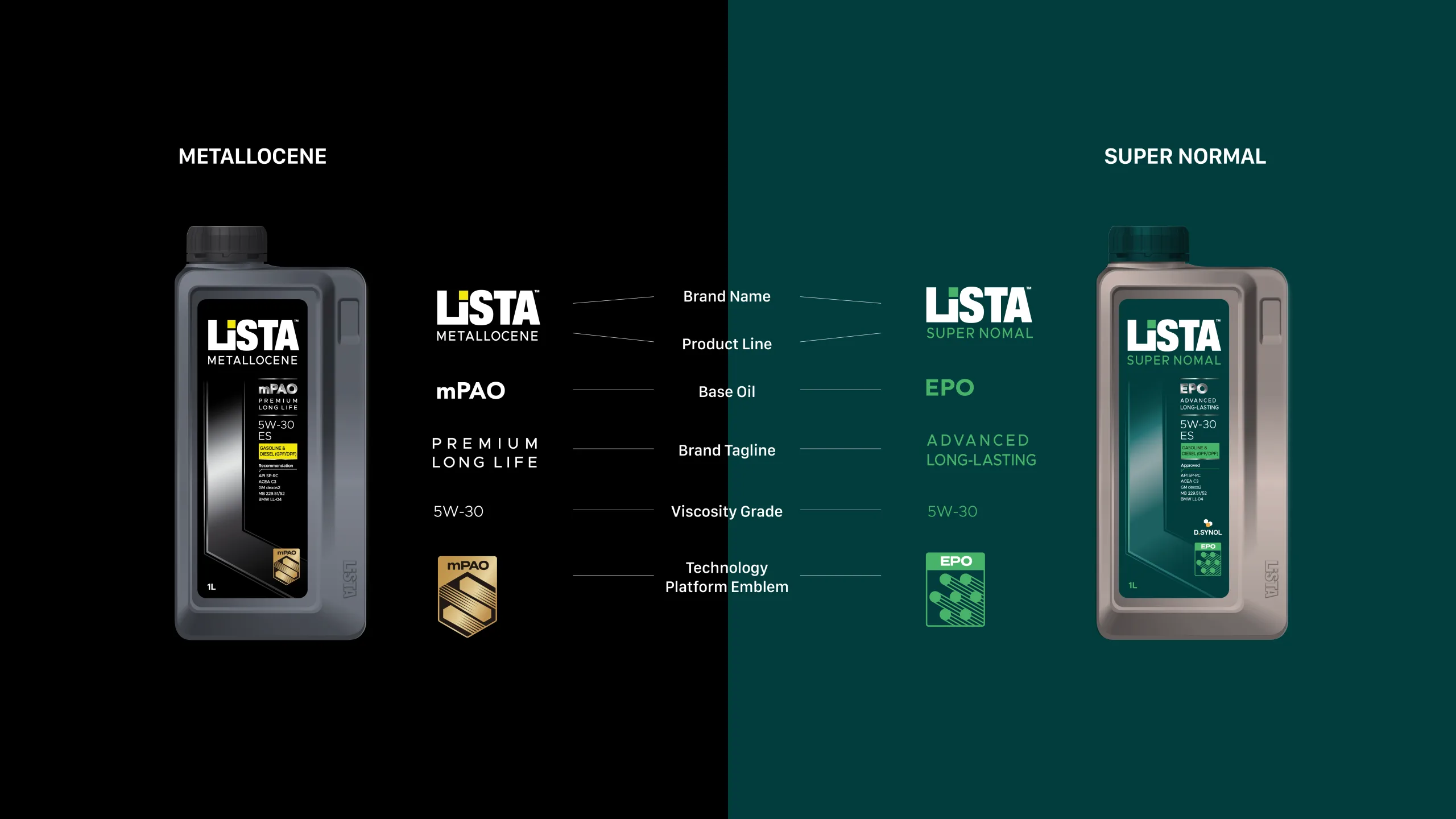
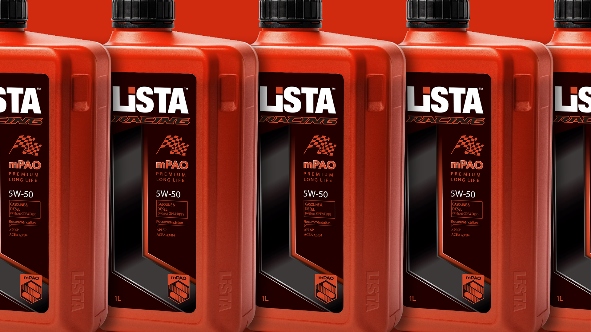
또한, 리스타 메탈로센은 세계최초로 Metallocene PAO를 사용한 최초의 승용오일로 초장기 수명과 엔진보호기능의 안정성과  뛰어난 저온점도로 엔진수명을 연장시키는 획기적인 제품의 특징을 가지고 있습니다. 

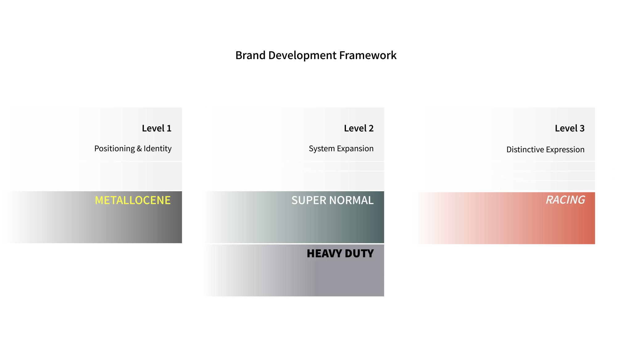
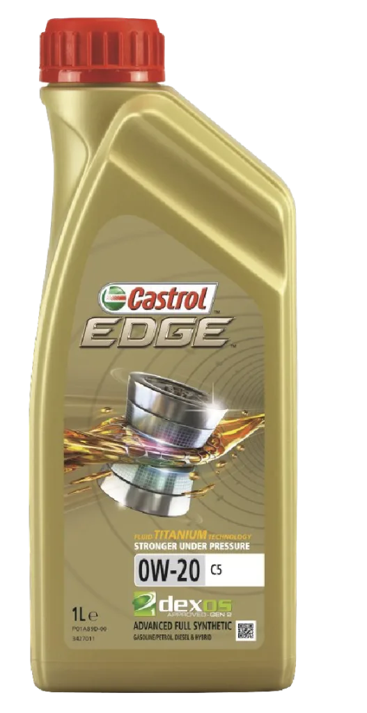
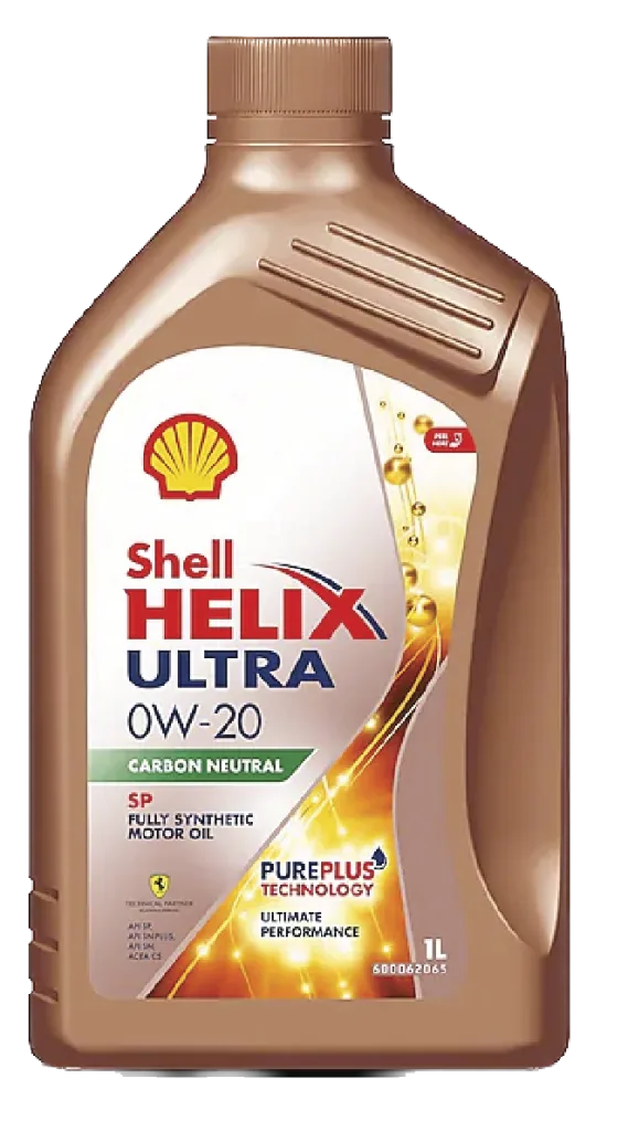
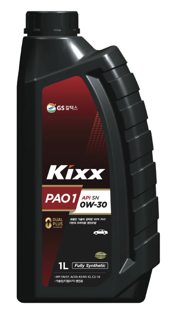
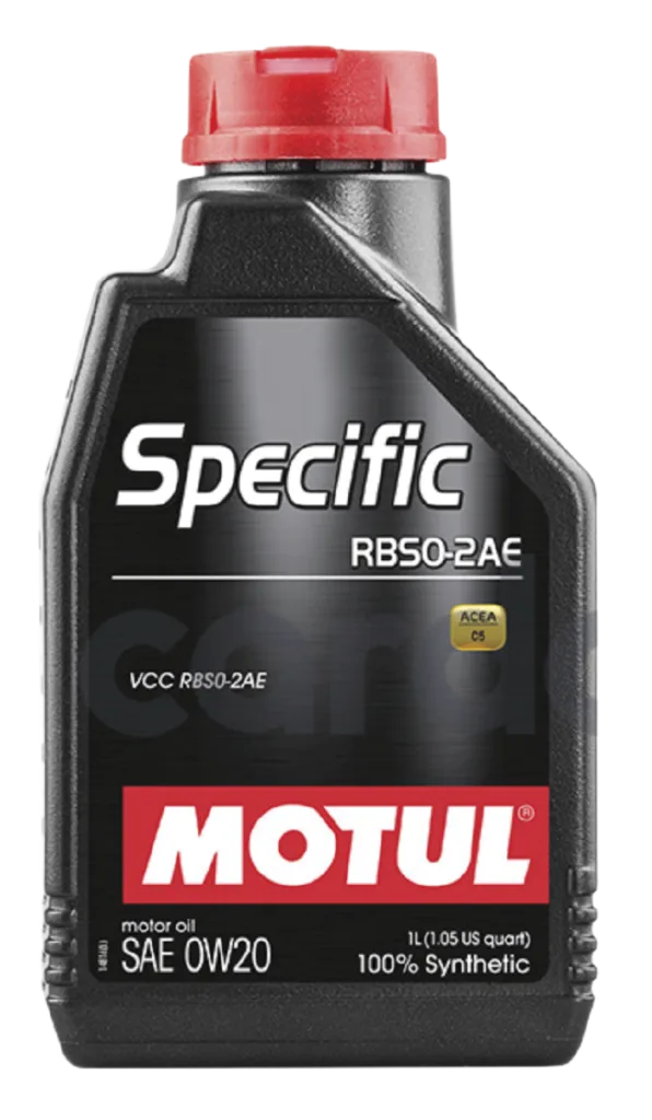
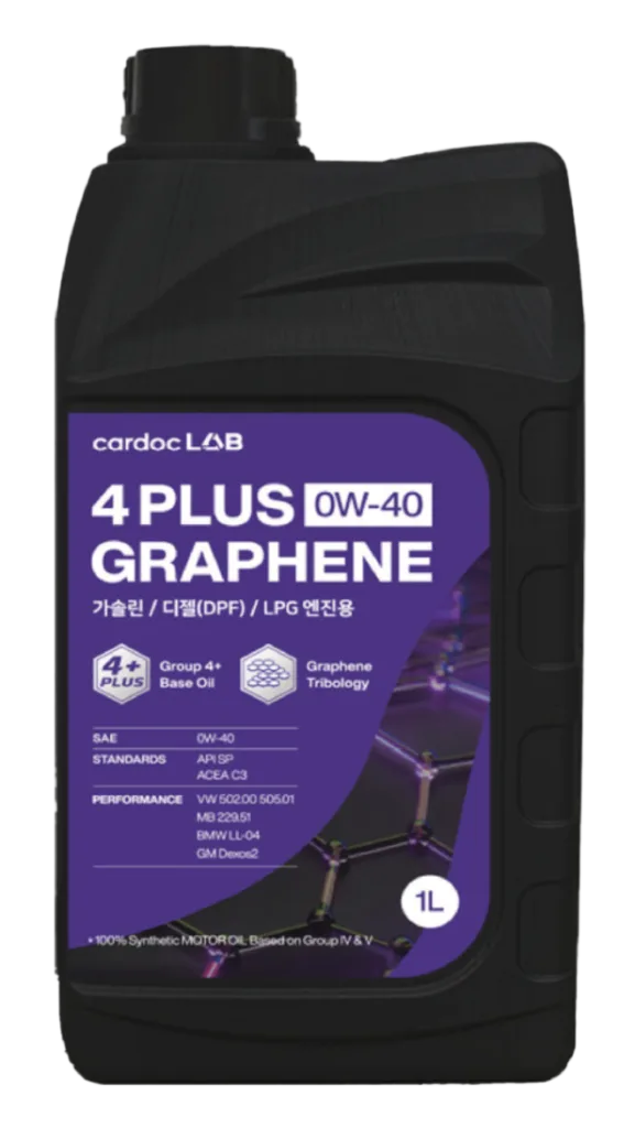
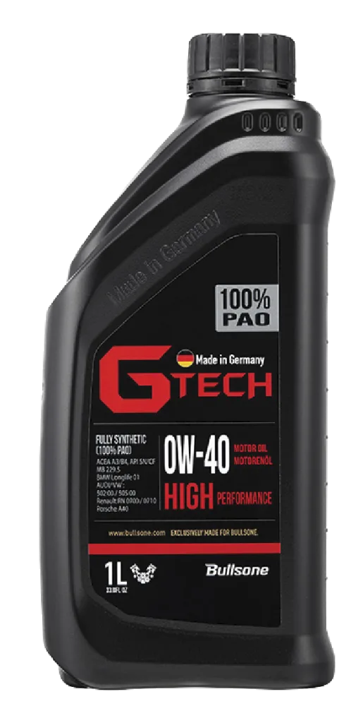
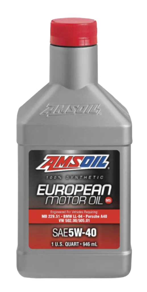
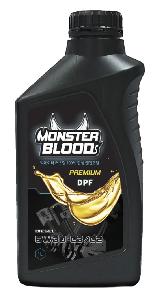
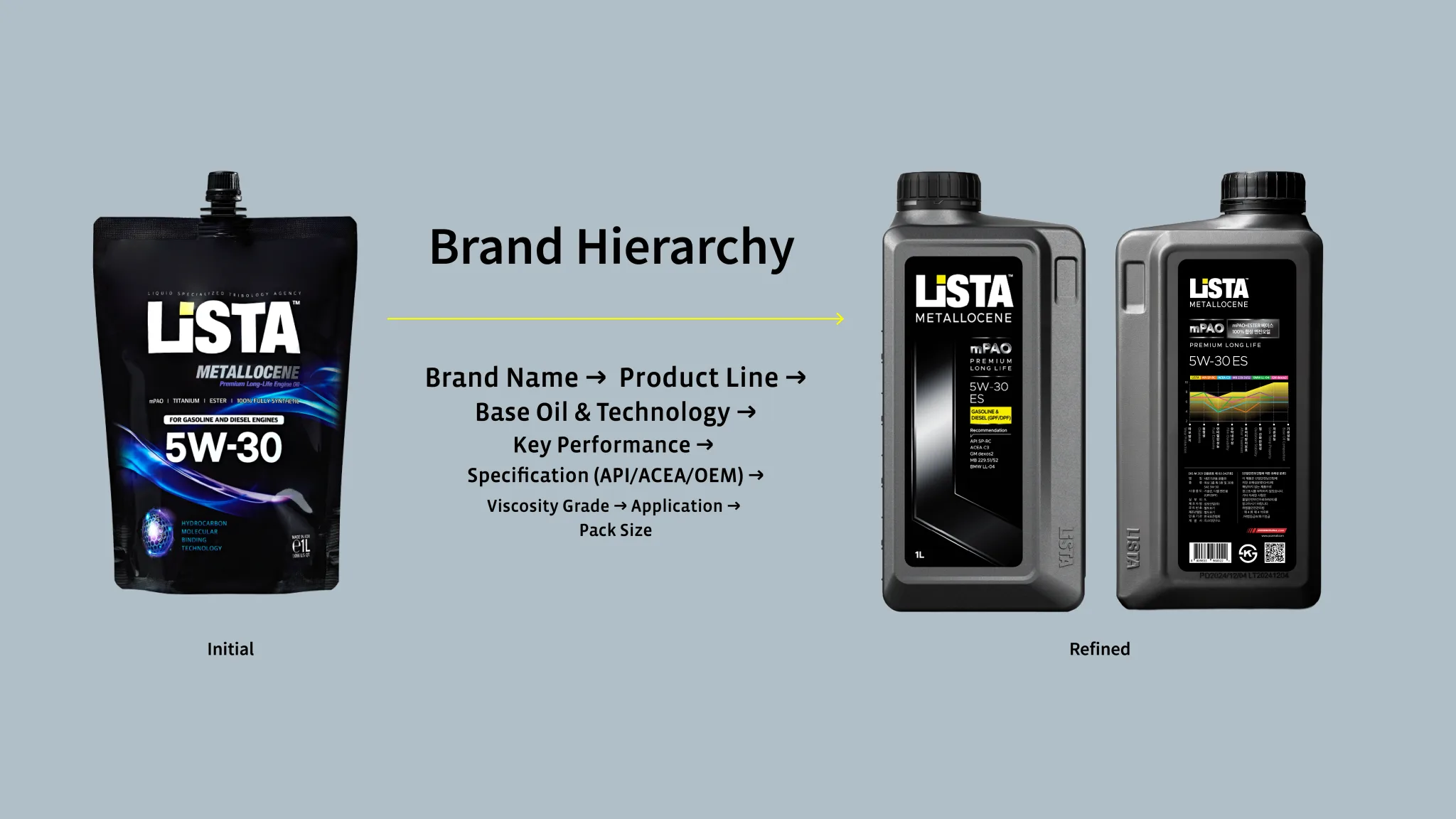
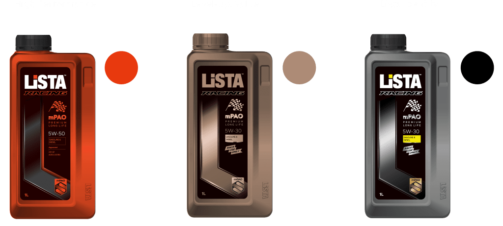
리스타의 패키지 디자인 프로젝트는 선행된 용기 개발의 연장선상에서 진행되었습니다.  기존 패키지의 현황과 사용자의 제품 사용 방식과 접근 행태, 그리고 메인 타겟의 선호도에 대한 심층적인 분석이 필요했습니다. 이를 바탕으로 리스타 제품의 성능과 정체성을 명확히 정의하고, 그에 따른 패키지 디자인 컨셉을 설정했습니다. 

The Naver Café “Enbulljin,” with over 84,000 members, has been operated for more than a decade by CEO Hyungrae Cho and Dr. Bohun Kim. It serves as a leading community for engine oil enthusiasts, where users actively share real experiences and professional analyses.

Picamall builds upon the trust and data accumulated within this community to establish a professional and authentic brand culture for Lista.

Listar Metallocene represents a category-shifting innovation as the first passenger car engine oil in the world to use Metallocene PAO, offering exceptional durability, stable engine protection, and remarkable low-temperature fluidity that collectively work to extend engine life.

The packaging design project advanced from the foundation established during the prior container development stage. Understanding the reality of the existing package, how users engage with the product, and what the primary audience values was critical. This research informed a refined definition of Listar’s product identity and guided the development of a packaging concept that expresses its performance credibility and brand direction with clarity and intent.

Sector

Consumer Goods

Expertise

Brand Repositioning

Brand Packaging

Visual Identity

스튜디오 라자는 프리미엄 메탈로센 시리즈부터 일반용 슈퍼노멀 라인, 상용차용 헤비 듀티 라인, 고성능 레이싱 오일까지, LiSTA의 전체 라인업에 걸쳐 패키지를 새롭게 구상했습니다.
각 라인은 고유한 특징을 가지고 있지만, 브랜드와 함께 성장하고 발전하도록 설계된 일관된 아이덴티티 시스템을 통해 모두 연결되어 있습니다.

Studio Lajah reimagined LiSTA’s packaging across its entire lineup — from the premium Metallocene series to the everyday Supernormal range, the Heavy Duty line for commercial vehicles, and the high-performance racing oil.

Each line was shaped with its own character, yet all are connected through a coherent identity system designed to grow and evolve with the brand.

Level 1

Positioning & Identity

BRAND Packaging STRATEGY

Uniquely Typical,

Strategically Smart

A modern and familiar visual system,
built on trust and stability,
while asserting a distinctive presence
that is uniquely Listar.

Key Players

Uniformity

individual

엔진오일 시장의 디자인 시스템은 기능 정보의 위계와 시각 체계가 안정적으로 유지되는 표준화된 브랜드 구조와, 과감하고 차별적 개성을 전면에 드러내며 매니아 성격의 독창적 브랜드 이미지로 구분할 수 있습니다.

The engine oil market’s design systems split into two approaches: a standardized structure built on stable functional hierarchies, and a bold, enthusiast-driven expression that showcases distinct character and pushes past conventional category norms.

LiSTA 메탈로센은 주요 고객층인 20~30대의 구매 관여도가 높은 소비자를 중심으로 하되, 세대와 무관하게 받아들여질 수 있는 브랜드 이미지를 목표로 했으며, 이는 안정적인 표준화 구조를 기반으로 하면서도 신뢰감을 주는 도회적 분위기의 고급스럽고 세련된 감성을 담은 기능적 디자인으로 완성하고자 했습니다.

이를 위해 기존 패키지에 포함되어 있던 모든 요소를 브랜드 체계에 맞춰 재정비하고, 핵심 요소 중심으로 체계를 단순화했습니다.  또한 강조해야 할 정보와 절제해야 할 정보를 명확히 구분해 전체적인 디자인의 완성도를 높였습니다.

LiSTA Metallocene targets highly engaged consumers in their 20s and 30s, yet strives for an image that feels relevant across generations. Its design is built on a stable, standardized structure, shaped with an urban sense of trust and a refined, understated sophistication.

All existing packaging elements were reorganized within a simplified brand hierarchy. Only the essentials were kept, key information was clearly defined, and unnecessary details were removed to create a clean and coherent visual system.

Level 2

System Expansion

LiSTA는 프리미엄 라인인 메탈로센을 시작으로 일반 제품인 슈퍼노멀까지 제품 범위를 확장했습니다. 이 과정에서 전체 브랜드 아이덴티티를 유지하는 동시에, 제품별 기능을 용기와 라벨 색상으로 명확히 구분해야 하는 과제를 함께 해결했습니다.

LiSTA expanded its lineup from the premium Metallocene range to the general Supernormal line. Throughout this process, the brand needed to maintain a consistent identity while also ensuring that each product’s function was clearly distinguished through the colors of its container and label.

Visual Grade Marker

리스타는 용기와 라벨의 색상 구분, 그리고 엠블렘 요소를 통해 브랜드 확장을 위한 시각적 차별화를 구현했습니다.

LiSTA achieved visual differentiation for brand expansion through container and label color coding, supported by emblem elements.

Level 3

Distinctive Expression

© 2016-TODAY studiolajah. All rights reserved.

Talk to us or Here to help

다양한 채널을 통해 저희와 함께 할 수 있습니다.

2F, 52, Bangbae-ro 11-gil, Seocho-gu,
Seoul, Republic of Korea

우 06687 서울특별시 서초구 방배로11길 52, 로열하우스 2층

Dongjak-gu

In brief

동작구는 '노들나루'를 중심으로 서울의 남과 북을 잇는 교통과 상업의 중심지와, 오랜 역사를 자랑하는 3개의 사립 대학과 함께 100여 개의 학원가가 밀집해 있는 교육의 요람 역할을 수행하고 있습니다. 국가와 민족을 위해 산화한 호국영령을 모신 서울현충원, 충신의 상징 사육신묘, 애국정신이 머무는 국사봉 등의 문화유산은 동작구의 철학과 문화적 기반을 이루고 있습니다. 또한 동작구는 우리나라 최초의 철도역인 노량진역을 비롯하여 대한민국 성장과 발전의 역사적 상징들을 품고 있어, 더 나은 변화를 위한 불굴의 도전 정신, 멈추지 않는 열정적인 에너지, 무한한 성장 잠재력을 정체성으로 삼고 있는 도시입니다.

Dongjak-gu serves as a central hub for transportation and commerce, connecting the north and south of Seoul, centered around 'Nodeulnaru'. It is also a cradle of education, home to three private universities with long histories, along with a concentration of over 100 *hagwons* (private academies). Cultural heritage sites such as the Seoul National Cemetery, which enshrines the patriots who sacrificed their lives for the nation and people, the monument to loyal subjects, Sayeongsinmyo (Tomb of the Six Martyred Ministers), and Guksabong Peak, a symbol of patriotic spirit, form the philosophical and cultural foundation of Dongjak-gu. Furthermore, Dongjak-gu embodies historical symbols of the Republic of Korea's growth and development, including Noryangjin Station, the nation's first railway station. Thus, the city's identity is defined by an indomitable spirit of challenge for better change, unstoppable passionate energy, and infinite growth potential.

City Identity

동작의 과거에는 새로운 시대를 향한 대한민국의 염원이 모여 철도시대를 열었고, 무한한 가능성에 대한 서울시민의 희망이 한강 이남의 발전을 이끌었습니다. 동작의 현재는 ‘올바른 가치’를 품은 선조들의 정신을 기반으로 전통을 재해석하고, ‘내일의 목표’를 향한 청년들의 열정이 모여 행복한 도시로 성장하고 있습니다. 동작은 앞으로도, 더 나은 내일을 위해 멈추지 않고, 계속해서 변화를 향해 움직이겠습니다.

In the past, Dongjak-gu was a place where: The aspirations of the Republic of Korea for a new era gathered, ushering in the age of railroads, and the hopes of Seoul citizens for infinite possibilities drove the development of the area south of the Han River. In the present, Dongjak-gu is: Growing into a happy city by reinterpreting tradition based on the spirit of ancestors who embraced 'righteous values', and by bringing together the passion of young people striving towards 'tomorrow's goals'. Moving forward, Dongjak-gu will: Continue to move towards change without stopping, for a better tomorrow.

Narrative

누구보다 앞서는 동작,
가치를 이어가는 동작,
미래로 나아가는 동작

동작은 언제나,
변화를 향해 움직입니다