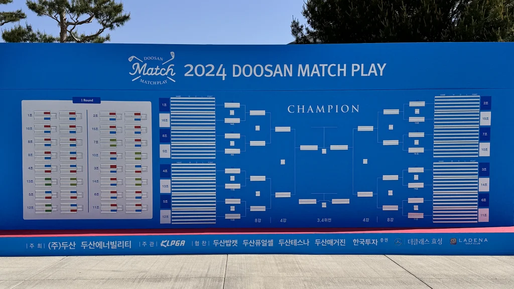
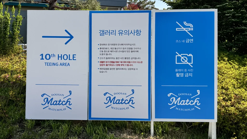
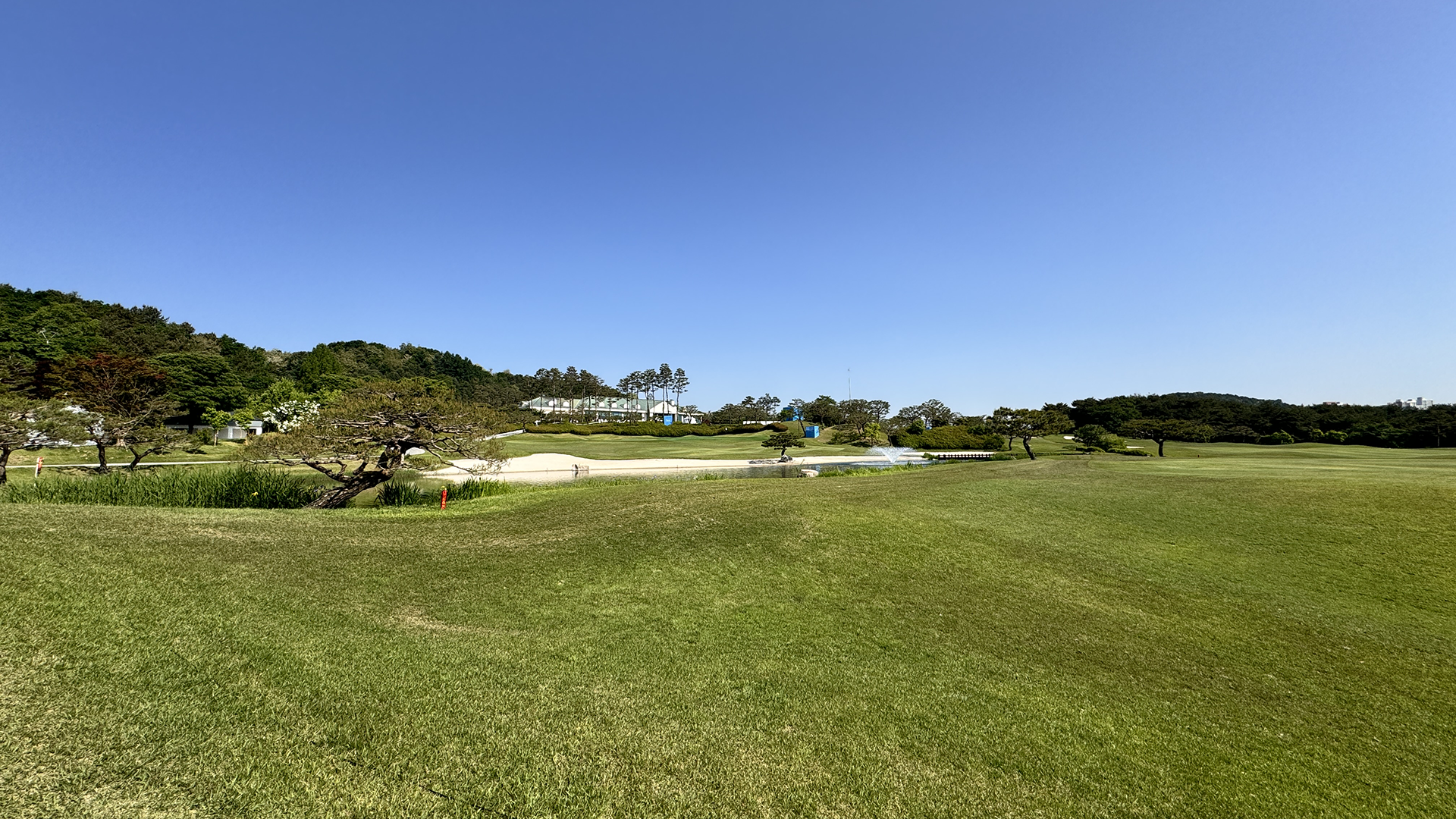
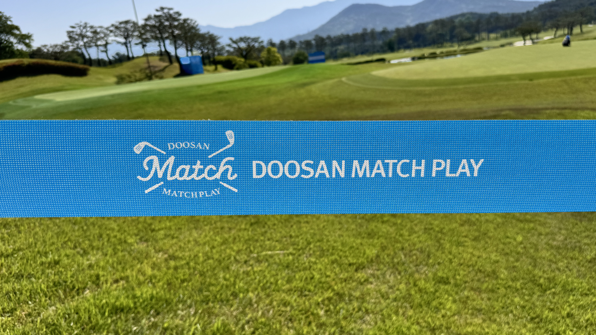
두산 매치플레이는 2008년 창설된 KLPGA 투어 유일의 정규 매치플레이 대회로, 최고의 ‘매치 퀸’을 가리는 대한민국 대표 여자골프 대회입니다. 64명의 선수가 참가해 조별리그와 토너먼트를 거쳐 우승자를 결정하는 방식으로 진행되며, 일반적인 스트로크 플레이와 달리 홀마다 승부를 겨루는 매치플레이 형식을 통해 차별화된 경기 운영과 관람 경험을 제공합니다.
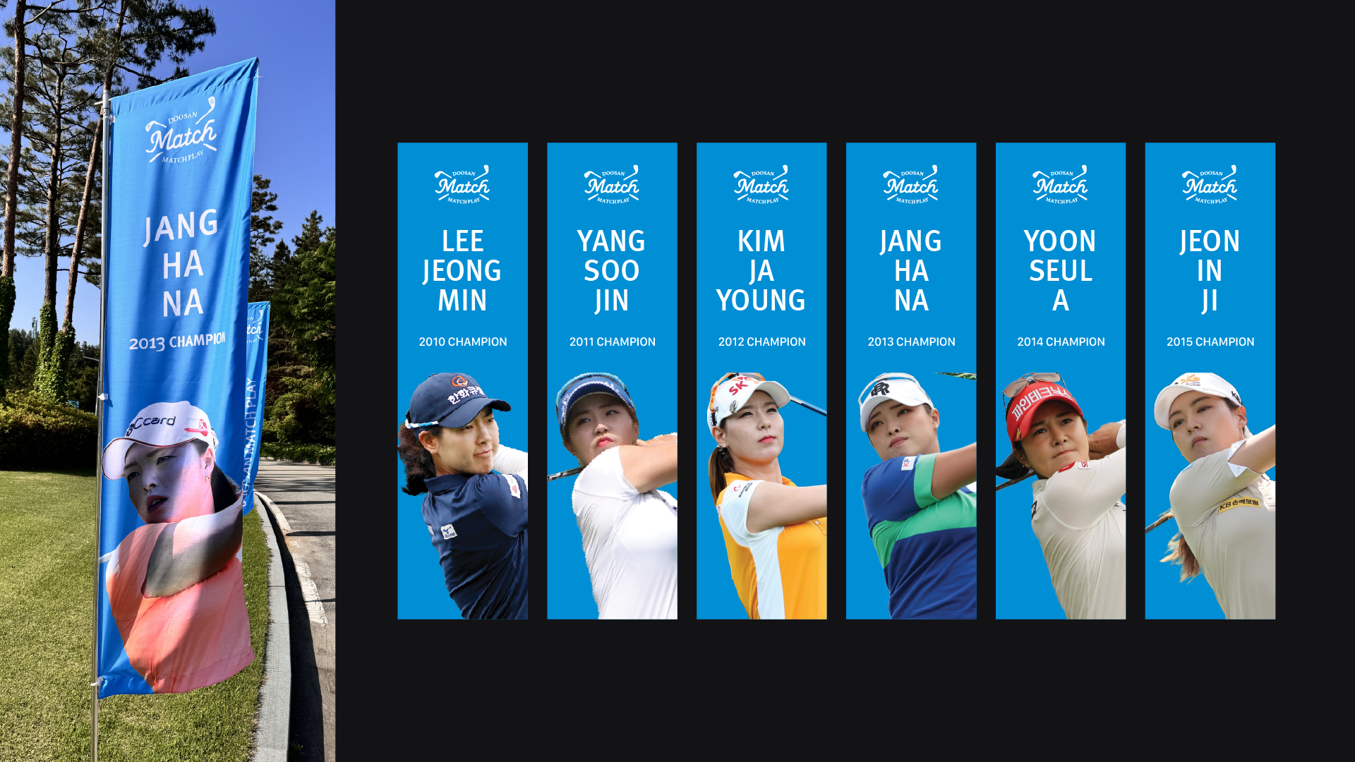
오랜 역사와 전통을 바탕으로 KLPGA 투어를 대표하는 매치플레이 대회로 자리매김하고 있으며, 매 시즌 수준 높은 경기와 다양한 명승부를 보이는 흥미진진한 대회입니다.
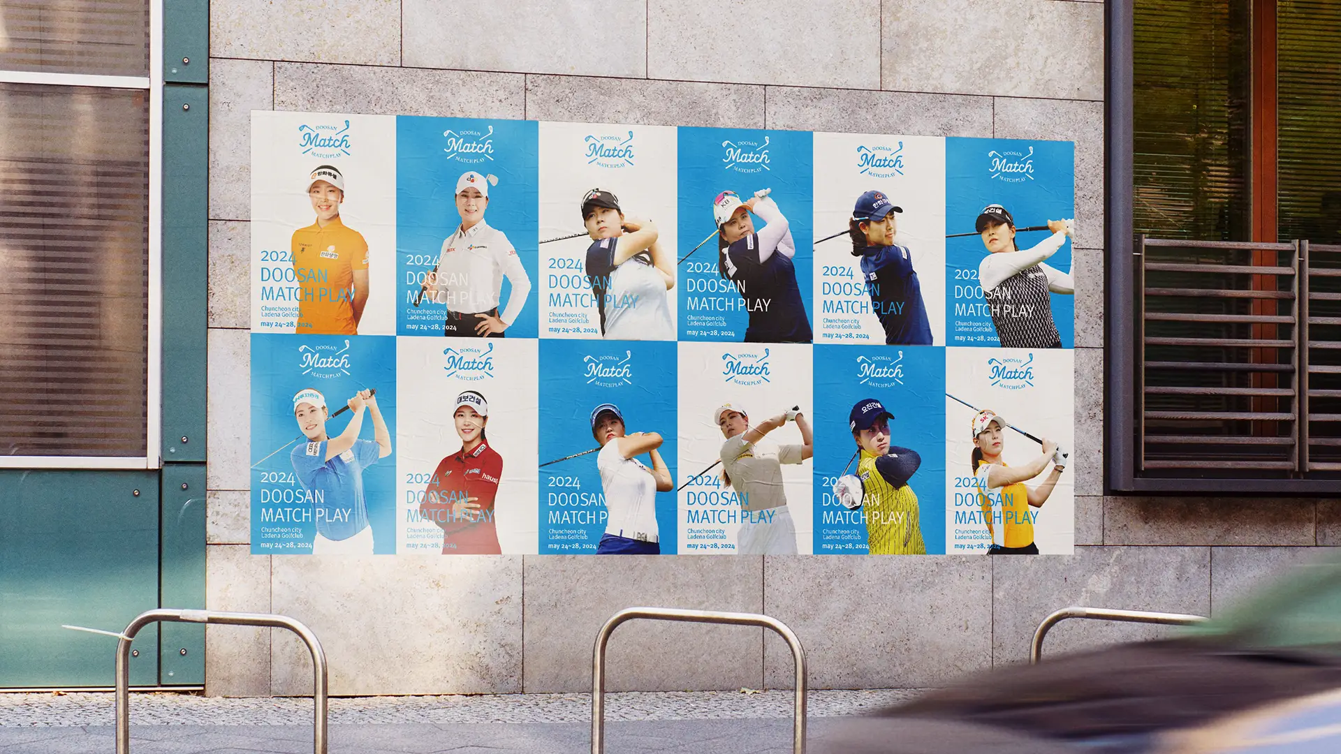
Established in 2008, Doosan Match Play is the KLPGA Tour’s only official match play championship and one of Korea’s premier women’s golf tournaments, annually crowning the “Match Queen.”
Featuring 64 players, the tournament combines round-robin group play and knockout rounds to determine the champion. Unlike conventional stroke-play events, the match play format creates head-to-head competition on every hole, delivering a distinctive sporting experience for both players and spectators.
With a rich history and strong tradition, Doosan Match Play has become the KLPGA Tour’s flagship match play event, renowned for its high-caliber competition, dramatic moments, and compelling one-on-one battles.
기존 로고는 두산과 매치플레이의 두 가지 정체성이 동일한 비중으로 구성되어 시각적 복잡성과 컨셉의 혼재를 발생시키고 있었습니다.
이에 따라 전반적인 시각 시스템을 재정비하여 보다 세련된 브랜드 이미지로 개선하고자 했습니다.
동시에 대회의 정체성과 역사성을 고려하여 전체 레이아웃은 엠블럼 형태의 구조적 안정감을 부여하고, 부드러운 곡선을 중심 키 비주얼로 설정했습니다.
또한 좌우에 배치된 골프채의 비대칭적 구성을 통해 매치플레이 특유의 긴장감과 역동성을 시각적으로 표현했습니다.
The original logo featured two distinct identities—Doosan and Match Play—given equal visual weight, which resulted in visual complexity and a lack of conceptual clarity.
To address this, the overall visual system was restructured to achieve a more refined and cohesive brand expression.
At the same time, considering the identity and heritage of the tournament, the layout was redesigned with an emblem-based structure to establish a sense of stability, while a soft, curved form was introduced as the key visual element.
In addition, the asymmetrical placement of golf clubs on both sides was used to visually express the tension and dynamism inherent in match play.
스튜디오라자는 동작구청과 협업하여 동작구의 브랜드 아이덴티티를 새롭게 구축했습니다. 호국정신의 역사적 배경을 바탕으로, 무한한 성장을 향해 도전하고 변화하는 동작구의 모습을 담고자 대표 이미지를 중심으로 다양한 환경에 유연하게 적용할 수 있는 디자인 시스템을 구축해, 안정감 속에서도 도전과 열정이 공존하는 구의 정체성을 표현했습니다.
Studio lajah collaborated with the Dongjak District Office to redefine the brand identity of Dongjak-gu.
Rooted in the historical spirit of national defense, the new identity embodies a district that continually challenges itself and evolves toward boundless growth.
Built around a core visual motif, the flexible design system expresses a sense of stability and passionate drive across diverse applications.
동작구의 창의성과 도전정신은 구정 활동의 다양한 성격을 반영한 색상과 아이콘 활용에 나타납니다.
메인 로고와 색상뿐 아니라, 여러 구정 활동과 구민들의 일상 속에서도 이러한 역동성과 에너지를 느낄 수 있도록 컬러 시스템을 구성했습니다.
The creativity and spirit of challenge that define Dongjak-gu are expressed through the use of colors and icons that reflect the diverse nature of the district’s public initiatives.
Beyond the main logo and color palette, the color system was designed to convey this sense of dynamism and energy across various municipal activities and in the everyday lives of its residents.